Trends in Covid-19 Spread

Summary
The John Hopkins University (JHU) collects data on how the COVID-19 virus spreads over the world and makes it available on github. In this analysis, we take the data and extract the numbers that describe how the growth of casualties develops. Looking at the trends in these numbers, one may deduce how fast or how slow the virus is spreading and also compare how the situation evolves in different countries.
Feel free to use the python implementation that produces the presented plots and that can be modified to show the results for any country that is in the JHU data base.
This post bases on joint efforts and discussions of the CSC group at the MPI Magdeburg.
The numbers in the presented plots are updated automatically1.
Table of Contents
Why This Analysis
If one looks at the actual numbers generated by an exponential growth, the overall growth is so strong, that one barely sees changes in the dynamics. If one looks at the numbers in log scale, the data becomes more handy. In log scale an exponential growth looks like a straight line and the slope of the line indicates how fast the exponential growth is.
To see whether the exponential growth changes its dynamics, one may check whether the line in the logarithmic plot changes its slope (hopefully it gets less steep). That’s why we plot the slope of the logarithmic line that connects the numbers of two consecutive days. Since the data is wiggly, we also plot averages of the slopes over 2 or 5 days to better spot the trends.
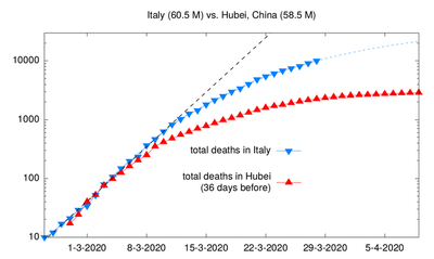
This post was inspired by an illustration that was discussed on twitter2 in the
last days:
The Analysis
We examine the (logarithmic) slope of the curves of the accumulated cases
per day. That is for day d and the day d-1 before that day, we look at log2(x[d]) - log2(x[d-1]), where x holds the number of accumulated deaths for every day
and where log2 is a function that computes the logarithm of a number with
respect to the basis3 2.
The resulting slope is exactly the daily increase in the number of cases in relation to the overall number of cases. As this is easier to interprete, we translate the slopes into the daily increase in percent.
Illustrative Examples
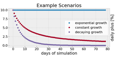
To make sense of the numbers, we start with some example scenarios. In the plot below, we have plotted the values for some fictitious growth scenarios.
-
An exponential growth – every day
dthe number of additional cases is1.1**d(speak:1.1to the power ofdand think of a daily increase by 10%). This scenario leads to a constant value in the plots of around0.14. -
A constant growth – every day another
10cases are added. This is like the number of daily deaths due to traffic incidents in Germany4 in 2010. -
A growth that decreases exponentially – every day the number of additional cases gets smaller exponentially.
General Explanations of the Numbers
- A constant value means that the number of deaths grows exponentially.
- If this constant is 10[%], this means that the numbers of cases doubles every week.
- A value of about 7[%], means a doubling every 10 days.
- A decreasing curve indicates that the exponential growth of infected people is stalled or reversed.
- If the value approaches 0, this indicates that the virus is contained.
What It Would Look Like and What It Should Look Like
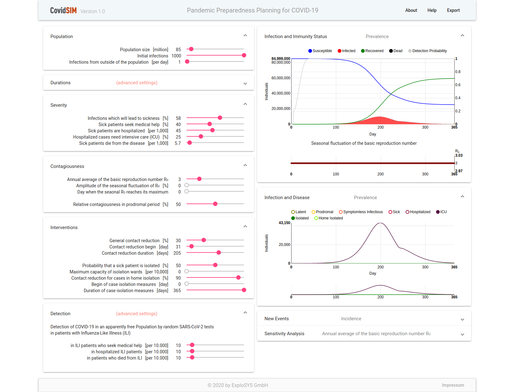
To have a comparison of what an uncontrolled spread and what a well controlled spread would look like, we ran two simulations in a covid simulator5.
- A scenario for Germany in which no interventions are taken.
- A scenario for which we defined interventions such that the number of hospitalized patients that require intensive care (ICU) was always below 45000.
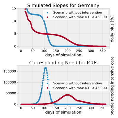
In the uncontrolled case, exponential growth is detected with a rate of 15[%] of daily increase. After some time, when most people have been infected the, growth decreases down to zero.
In the controlled scenario, the rate is brought down in the initial phase. Then, exponential growth happens at a lower rate (in the plot the value is about 5[%]) though for a longer time before it fades out.
To relate the slopes to the actual cases, in a second plot, we display the corresponding numbers of people that will need intensive care in a hospital. In our model, we assumed that 1.15% of the infected people will have to be treated in an intensive care unit.
The Actual Numbers
We use the JHU for the last 100 days and plot the slopes for the last 90 days. The moving horizon of 100 days makes the changes of the last 3 months better visible. By plotting only 90 days, we omit a part of the wiggly behavior in the start of the data (which however is not relevant for the main part).
The last 100 days
See the pdf file for more countries and a better resolution of the plots.
 for all countries.](/post/covid-19-trends/slopes-dsifc_huec5b45d5e7a228d1039c3476074f8cae_355676_462b8ff03a40580ea06578686bf6a782.png)
The last 30 days
Since we look at the relative growth, so called saturation effects will make changes less visible. This happens in particular, with a high number of cases but a low number of active cases. In the long run, exponential growth will still be visible, but also the short term dynamics are of interest. For example, to spot the start of a second wave.
That’s why the following plots consider the daily numbers for the last 40 days (leaving aside all cases that happened before) and show the daily increase of the number cases in percent for the last 30 days.
 for all countries.](/post/covid-19-trends/lmslps-dsifc_hubdfbeded682834e85db15ab1b5fad1c5_223303_3a976ebcedfa75579cb0a725d18bc984.png)
Notes and Acknowledgements
Disclaimer
This analysis is purely based on empirical trends. No statistical data analysis tools have been applied to (pre-)process the data, like data denoising (except that some outliers might not be shown because of the plot margins).
Acknowledgements
The initial work, namely making the data easily available in python as well as the code that produces the title picture, was done by Petar Mlinarić.
-
Updates once a day in the morning. ↩︎
-
The plot is by the Italian Physicist Prof. Ricci-Tersenghi ↩︎
-
The basis is not too important here. If one takes 2, then a value of 1 means a doubling. A different basis would only scale the plots but not change the qualitative outcomes. ↩︎
-
covidsim.eu with parameters as recorded in the screenshots 1 and 2 based on the assumptions used of the RKI publication mentioned in the footnote below. ↩︎